Design Tips to Increase Click-Through Rates for Content Sites

As a content and affiliate marketer, you’re a slave to three important metrics that represent a very simple process.
At the start of the process is traffic – the number of visitors who reach your various product lists. Generating traffic is mostly about search engine optimization since the majority of visitors will find your product pages through Google.
At the other end of the process is conversion or sales. Sadly, as an affiliate marketer, conversion rates are mostly out of your hands since the landing page’s design and content are in the seller’s hands.
What affiliate marketers do have power over, though, is the metric in the middle of the process: click-through rate (CTR).
CTR refers to the percentage of your product page’s visitors who click on any of the products you’re promoting – navigating to the seller’s landing page where they’ll (hopefully) complete a purchase.
In today’s post, we’ll take a look at design techniques you can use to maximize this critical stat and boost your revenue as a result.
Use Color Psychology
Certain colors are known to trigger specific emotions in your users. Blue makes people feel like they can trust the site. Green makes visitors feel tranquil and secure. Black triggers a sense of opulence and luxury. And red makes visitors feel excited. It makes them sit up and take action.
Red is a terrific color to use (sparingly) if you want to promote action. People typically associate it with sales, discounts, special offers, and other commercial announcements that benefit them.
Red is also a color that can communicate urgency. E-commerce sites often use red to show that only a limited number of items are still in stock. Check out Booking.com to see this concept put into action.
As users browse through their accommodation options on the travel website, they’re shown the occasional message reading: “only one room left on our site.” The message is all in red.
Using red on your affiliate site is a great way to grab the attention of your readers and urge them to click through to the product’s landing page.
Newsweek shows us how to do this subtly and elegantly as shown on their best mattress review post. The site had a very neutral color scheme, consisting mostly of black and white. Red is only used to indicate hyperlinked text and as the font color for the product names.
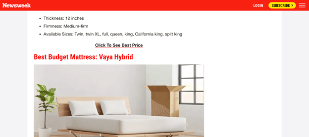
source: newsweek.com
This is a very smart way to infuse urgency into your affiliate page without overdoing it.
Display Multiple Links Per Product
Some of your visitors may find a blatant overuse of seller links a little annoying. After all, they’ve come to your product page to learn more about the products you’re promoting, not to be aggressively sold to.
At the same time, there are ways you can maximize the chances of your visitors seeing the product page links without running the aforementioned risk.
Using one primary CTA is a great idea, especially if it’s labeled in a way that catches the visitor’s attention and spurs them into action. However, some affiliate sites also choose to link one or more of the following page components:
- The heading or title.
- The first time the product’s name is mentioned in the descriptive text.
- An image of the product
The key is not to overdo it and make the reader feel like they’re reading a long-form advertisement. By and large, people go to affiliate sites because they want to learn more about their various options.
Don’t compromise your content’s credibility by forcing a clumsy sales pitch down the reader’s throat.
New York Magazine’s excellent affiliate section shows us how to create multiple CTAs per product without making the article look like an ad.
Use a Compelling Call to Action
Once again, it’s a good idea to have multiple CTAs per item in your product list. However, it’s vital that each product has one highly visible link to the seller’s page. This link isn’t hidden among the rest of the page’s content and compels the visitor to click on it.
If you’ve spent a lot of time on affiliate sites, you may have noticed that there are dozens of ways to make these primary CTAs compelling. Here are some proven design techniques, along with examples.
Striking Colors
Use a color that compliments your site’s color scheme but isn’t used elsewhere.

A Recognizable UI Element
Web users are used to clicking on visual elements that look like buttons. Take advantage of this by making your CTA look like a typical button that you’d find elsewhere on the internet, such as the ones used by Business Insider’s affiliate articles or Web Integrations Aberdeen’s service page.
Engaging Link Text
The text you use to drive a click-through should be action-focused. Always use a verb and tell users what they can expect once they’ve clicked on the link.
- Expertreviews goes as far as telling the user where the link will take them.
- Outathomeplate uses a full sentence to create curiosity.
- RTINGS keeps it simple by using only two words next to the seller’s logo.
Provide a Handy Comparison Table
Affiliate product pages can be a tad on the heavy side, often promoting in the region of 10-15 products and providing a lot of detail on each of them.
Some visitors may find themselves overwhelmed with this amount of information and could head to one of your competitors’ sites where they don’t have to do as much reading.
Granted, this doesn’t apply to all of your site’s visitors. But it’s still worth catering for people who are just looking for a summary rather than in-depth product discussions.
The answer lies in a comparison table listing each of the products you’re promoting. Highlight the key differences between each of them and, most importantly, provide a link through to the seller’s landing page.
Some Final Thoughts on Analytics
Before we sign off, let’s discuss the importance of analyzing the changes you make to your affiliate site’s product pages.
Since you’re doing this to improve click-through rates, you’ll want to have a clear view of your current CTRs that are based on a big sample size.
Once you’ve got this, don’t simply make wholesale changes to your product pages. Do them incrementally, measuring the impact on your CTR after each one. This way, you can map success or failure to one specific change rather than having to guess which worked for you and which didn’t.
The last thing you want to do is implement a change that damages your CTR and not be aware of it.
You have to be patient and methodical about this. You have to base your permanent site changes on applicable data.
The stakes are too high to be haphazard about this.
Subscribe to our newsletter